
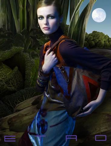
I usually try to avoid image spamming but I just couldn't help myself this time. I'm completely in love with Etro's FW 08 ad campaign and I had to share all of it. I'm a little confused though. I found the runway show a little lackluster. Where are all these wonderful colors coming from? Just photoshop? Because I found the actual colors on the runway to be very toned-down for Etro this season. This campaign is better than the clothes.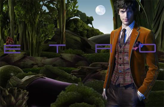
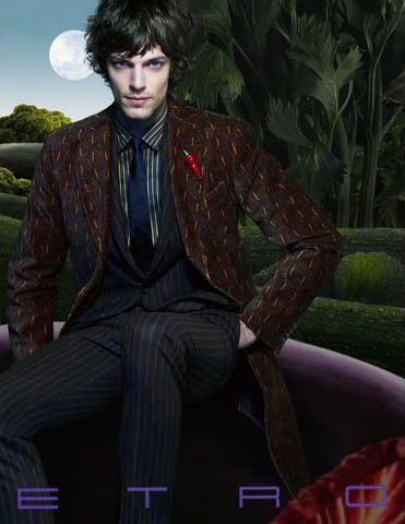
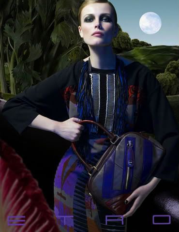
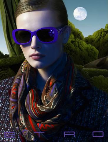
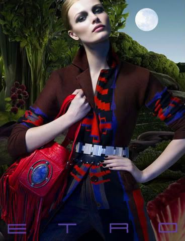
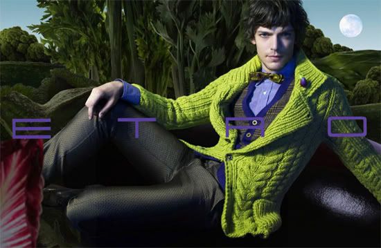
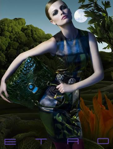
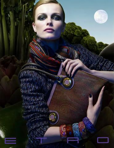
Images from MaxCardelli.com via idolfan8890 on tfs.com
2008-07-11
A Step Up
Subscribe to:
Post Comments (Atom)


12 comments:
those are cool. The images have a very painterly quality to them (influenced by Rousseau??) and it looks like the colour saturation of the clothing may have been amped up for the ad. Love the giant vegetables too...
I agree--the ads are lovely.
that guy is hot! lol.
I agree with Shay, there is a painterly quality to the ads. They definitely reference an artist but can't think of who.
I love Etro! This campaign is so pop, very enticing. I'd buy the clothes!
Thank you for showing it to us.
LM
x
Oooh these are very surreal, I love them!
The ads are lovely, and I like the colors. Thanks for sharing this!
P.S. I've tagged you. :)
i think it's due to good lighting and photoshop, for the most part. i'm sure the clothes are lovely in real life though.
Yes, Henri Rousseau's jungle art works are exactly what popped to mind when I saw these!
That painterly shift dress is stunning, as are the accessories. You are right though the runway colours are more subtle than those in the ads.
The Etro menswear line is so beautiful. Love the hidden lining under the lapels.
phenomenal photography-- I love ads like this (:
These remind me of the Custo Barcelona ads from 2005? 2006?
Post a Comment