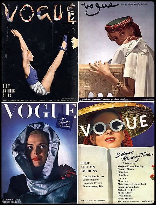
This morning I happened upon this little goldmine of fashion's past. What a wealth of inspiration! When looking at today's ugly text-filled white-background covers, it's easy to forget that fashion magazines were once very fashionable! It's so refreshing to see that they felt at liberty to alter the iconic Vogue logo in order to harmonize it with the rest of the cover. Truth be told, I think that the font they've been using for ages now is on its last stretches. Actually, the whole layout of the magazine is very tired and dull, and their cover choices have become progressively worse. I understand that American Vogue is targeting a different market than Italian or French Vogue, but that is no excuse for letting the brand stagnate. So maybe the really sexed up covers that sometimes make an appearance in Vogue Paris aren't for American Vogue, ok, but the Vogues of the past have managed to exhibit both class and forwardness. I was particularly horrified to see a very photoshopped Gwyneth Paltrow on this month's cover, arm slung over a robot head as a nod to the 133598th super hero movie Iron Man. I can't think of any other reason why a fashion magazine would associate itself with a generic blockbuster movie besides profit. I'm just itching to see what will happen when Anna Wintour finally resigns. Most likely not very much, however.
2008-04-22
American Vogue in the Emergency Room
Subscribe to:
Post Comments (Atom)


2 comments:
Ah...the ever-ongoing conversation about the downfall of US Vogue.... it is a shame but I doubt a new radical editor would change things... I reckon it's a Conde Nast decision really to make US Vogue as bland as it is...
I wonder if market research is telling them that this is what the public wants? I'd be really interested in reading their reports. Considering the tabloid craze in America, it could be very likely.
Post a Comment